Contagious Rebrand
Creative work for Contagious Bible Ministries, a Christian charity that provides youth residential conferences every summer throughout the UK.

Setting the Scene
The original Contagious logo was developed 14 years ago and was in need of a revamp. Looking to the future, it was clear the brand needed an energetic, vibrant and adaptable brand that engaged with its young people more effectively.
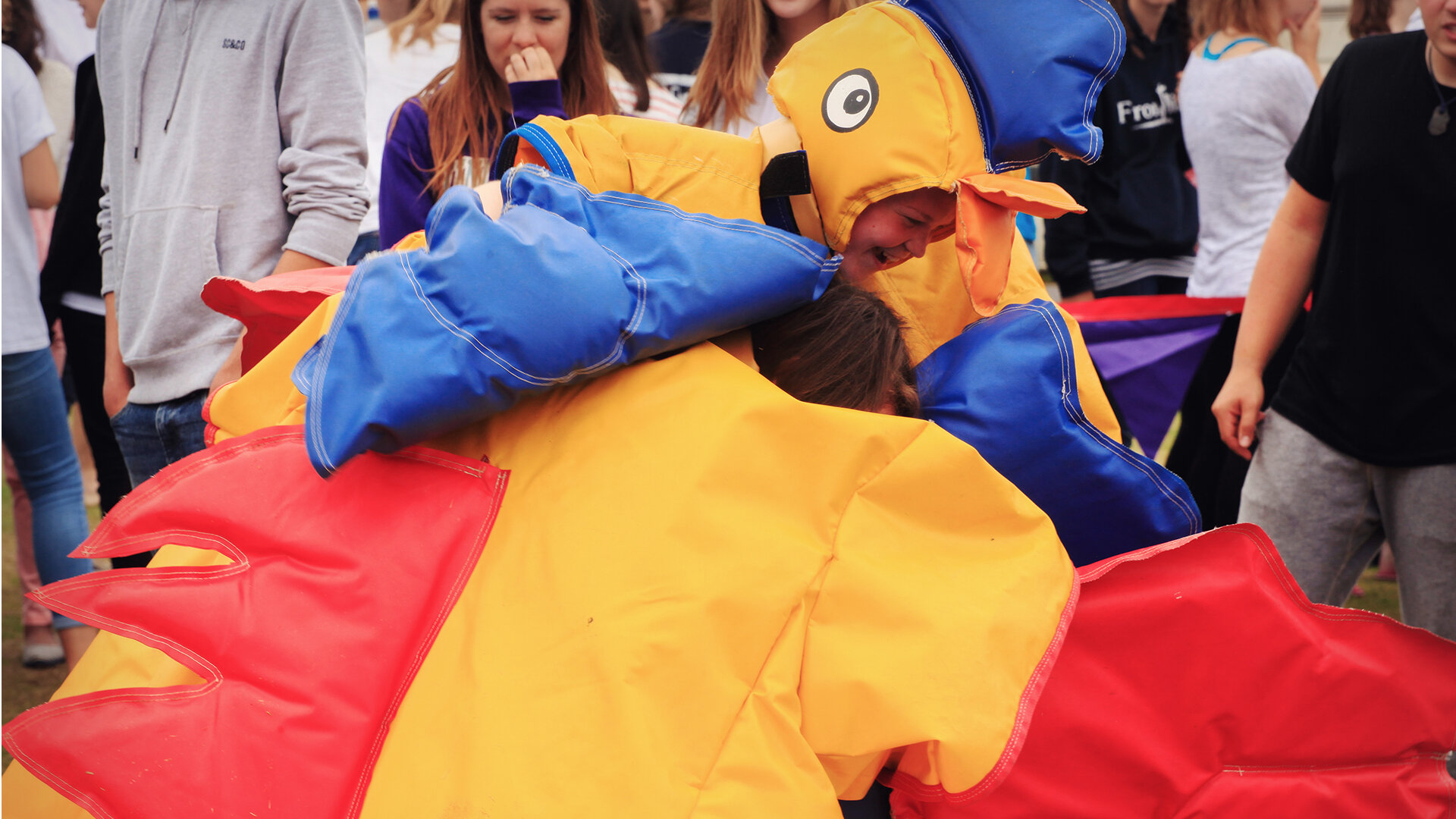
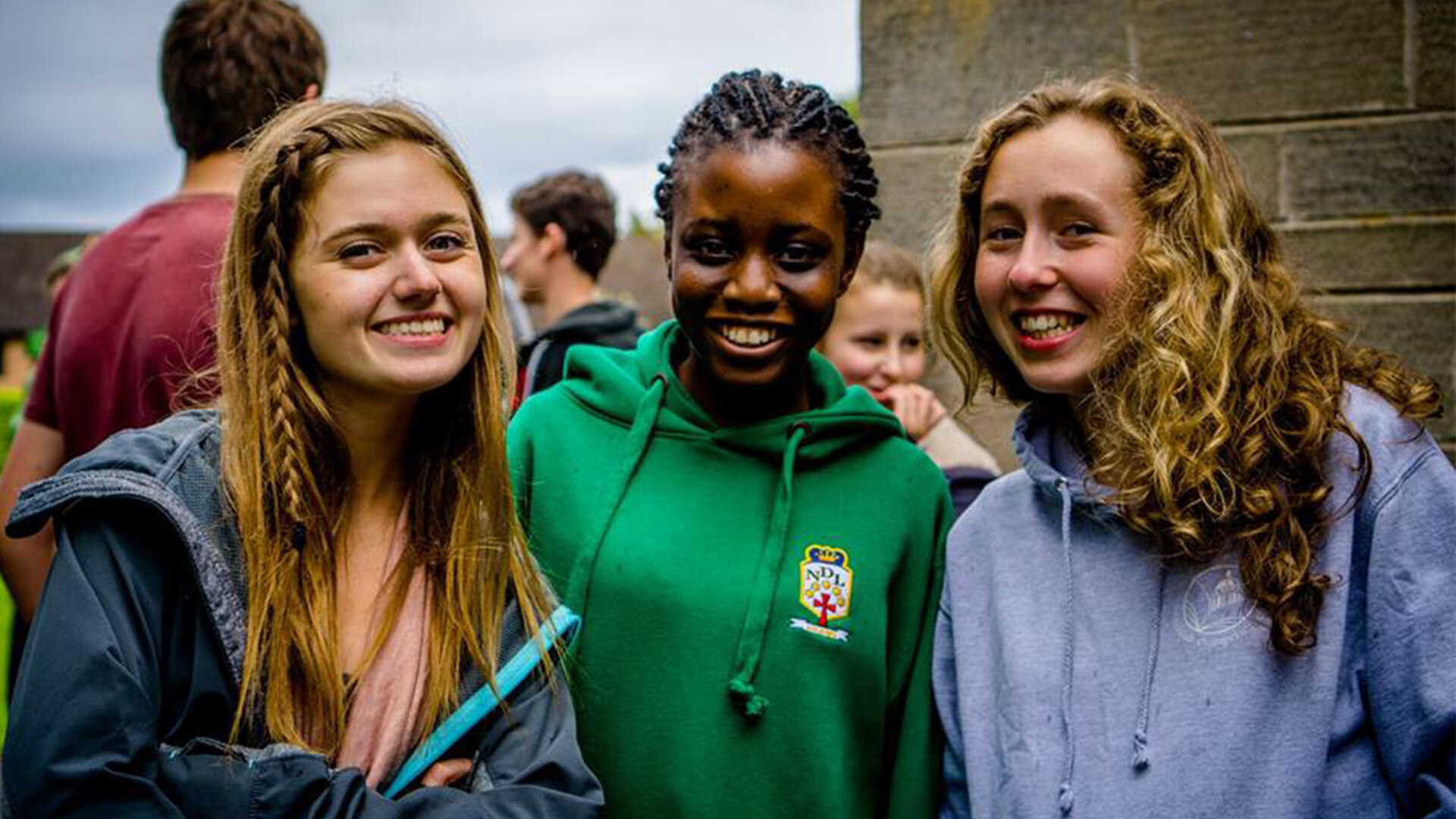
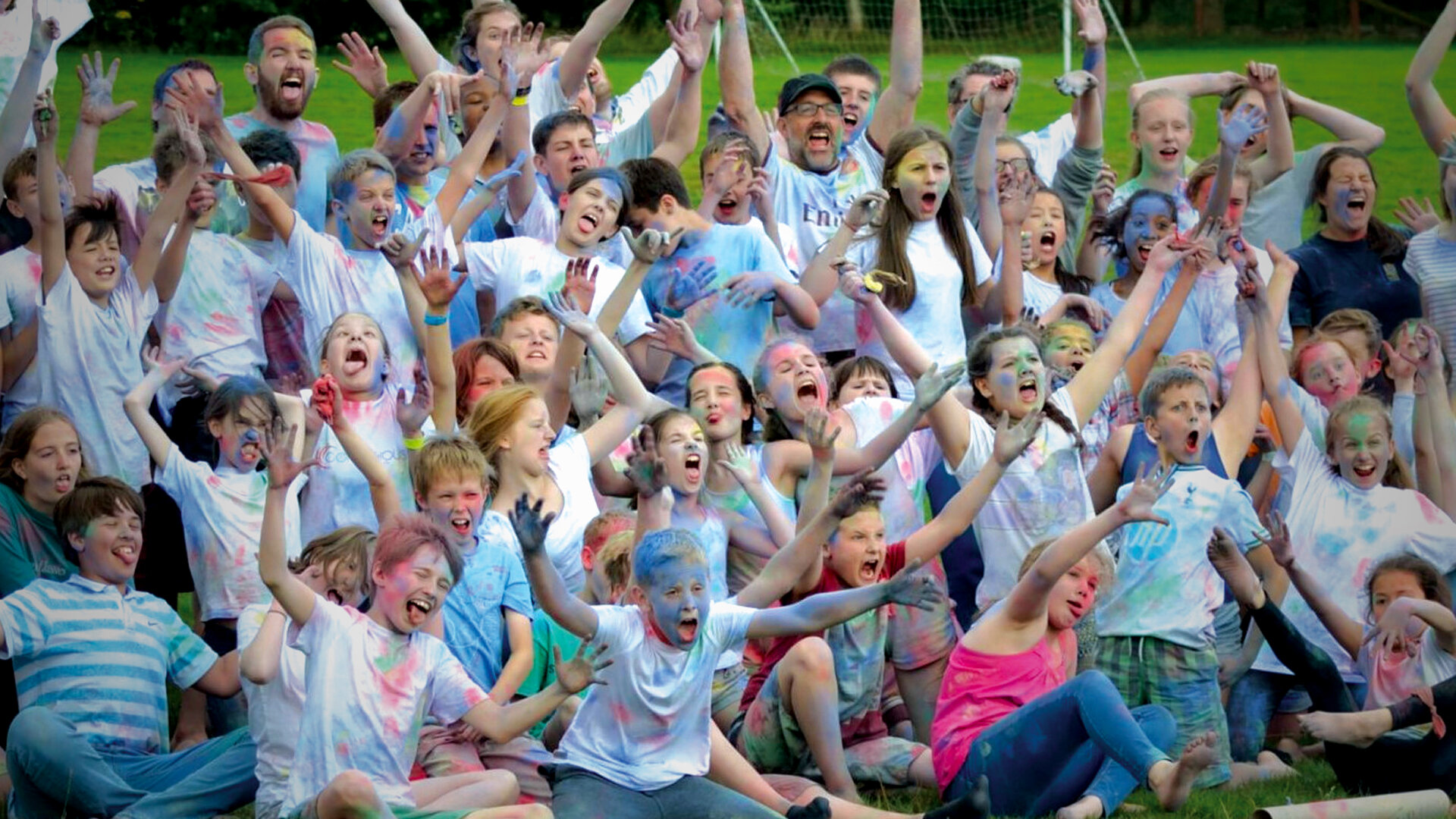


Bold, edgy & expressive.
The simple ‘C’ shape acts as a window in which textures, patterns and colours can be encorprated. The dynamic logo has the ability to adapt to multiple styles and personalities, reflecting the different age groups and conference themes each year.

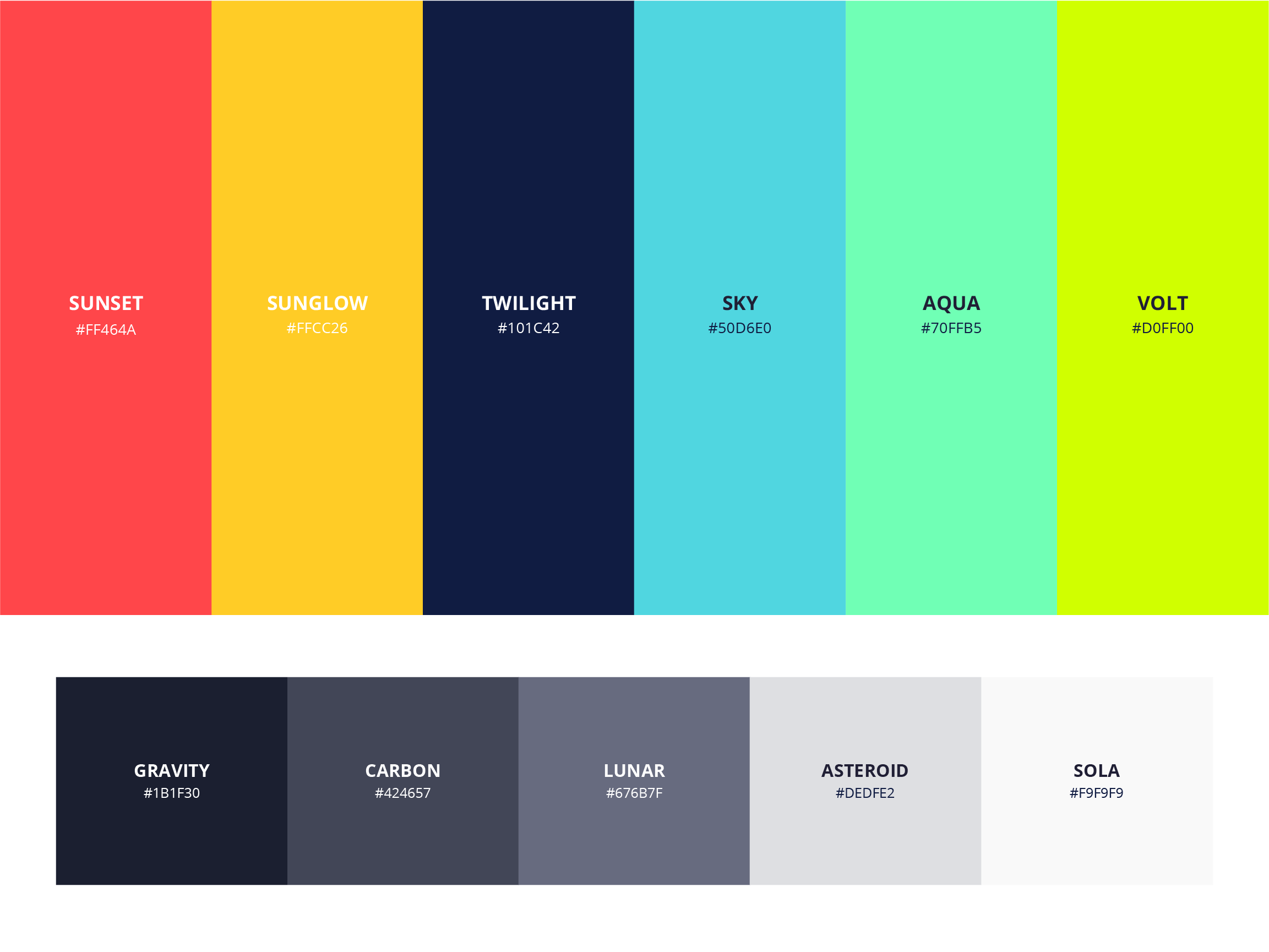
Brand colours
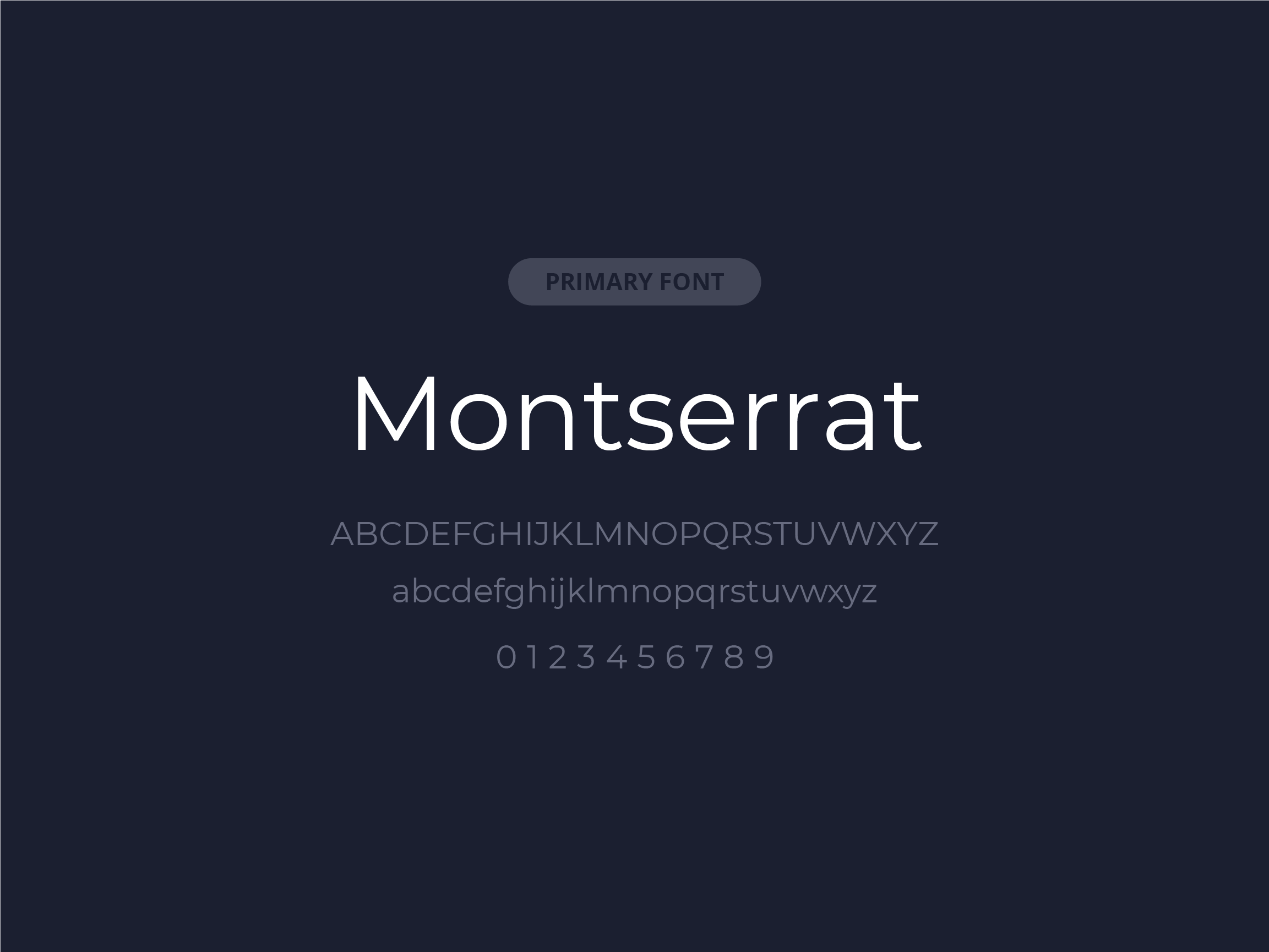
Primary font

Secondary font

Single colour options

Monogram logos
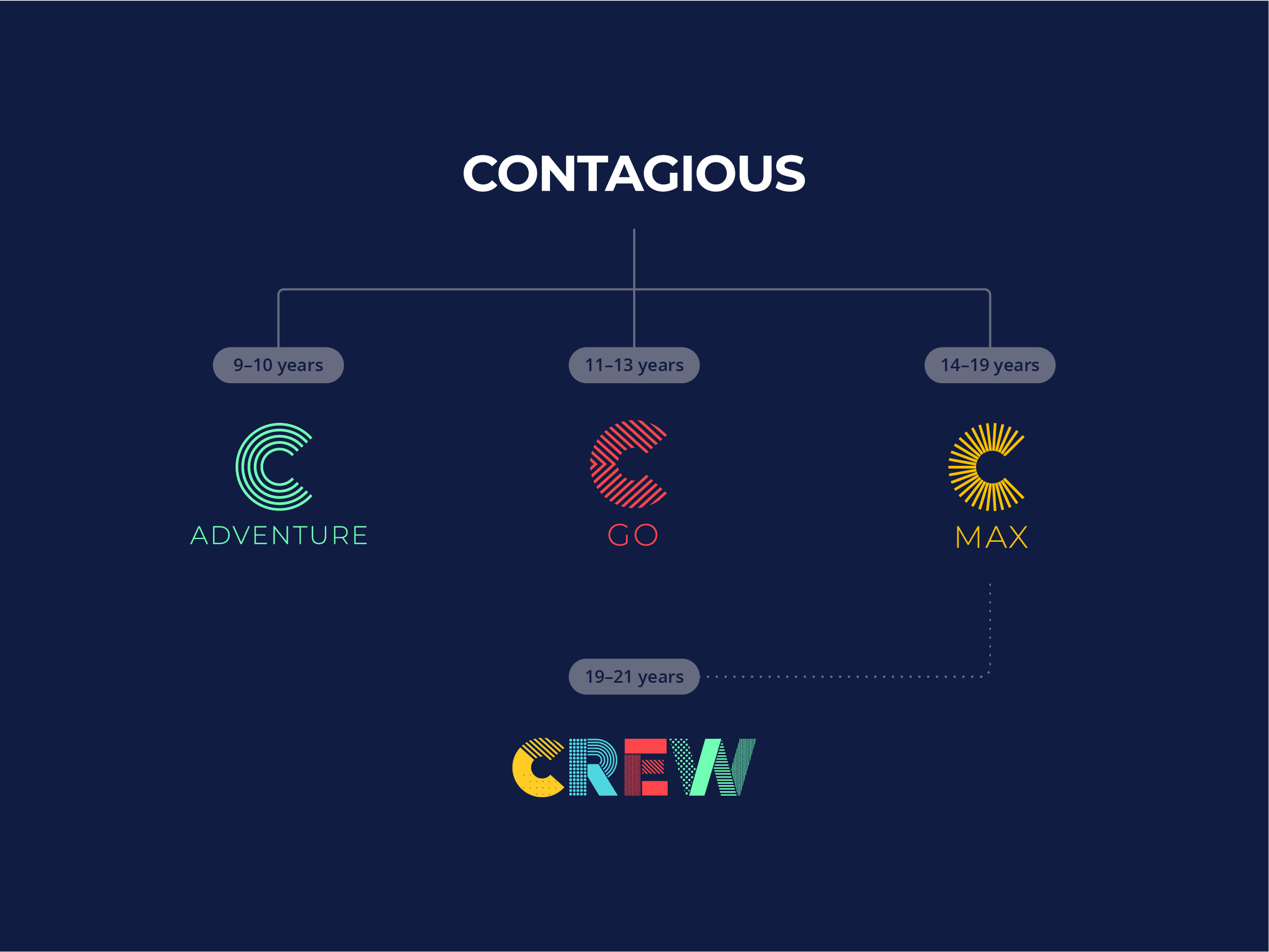
Brand structure
CREW
A training programme for 19-21 year-olds, responsible for a range of practical tasks to make the conferences run smoothly. The overall goal is to help them be better equipped to serve as leaders at Contagious in the future, as well as serving God within their local church.
As the team works across each of the different conference age groups I’ve incorporated the patterns and colours from all the logos.


