CareerSteer
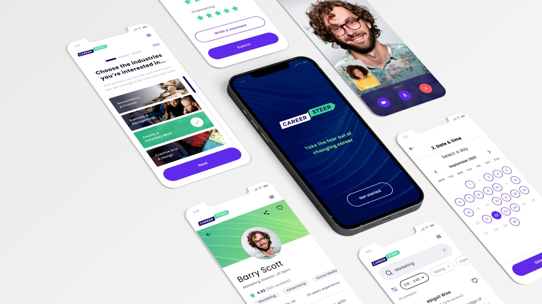
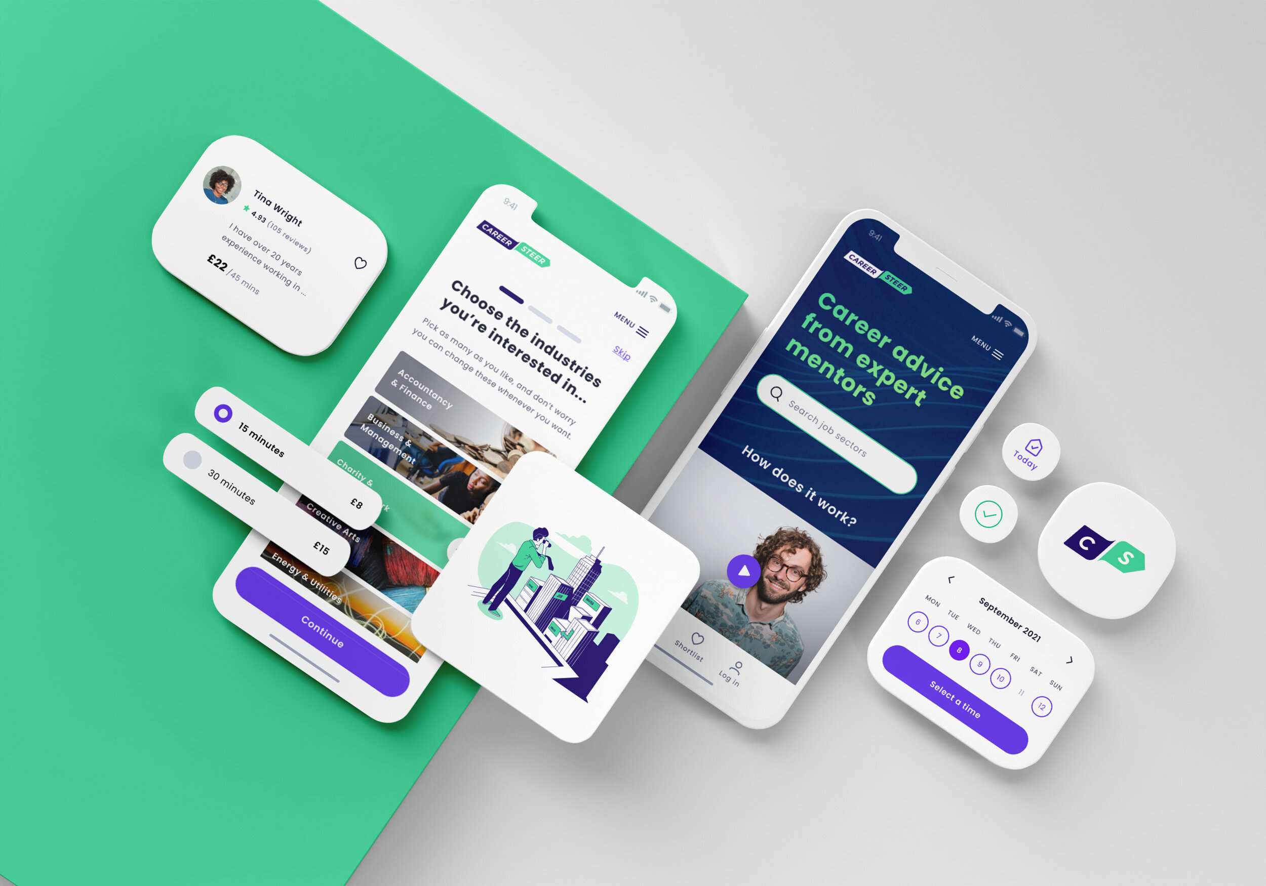
A responsive web app allowing people seeking a career change to connect directly with experienced professionals for advice.

The project.
This project formed the core part of my UX Immersion course with CareerFoundry. As the sole designer, I was responsible for the entire design process, from research to a high-fidelity prototype.
Duration: 5 Months
Methods:
User Surveys
Interviews
Card Sorting
Affinity Mapping
A/B Testing
Usability Testing
Wireframing
Prototyping
Tools:
Figma
Adobe Illustrator
Mockup
Optimal Sort
UsabilityHub
Google Forms
Zoom
The problem.
People looking to change careers need a way to connect with professionals to explore their options and make sure they're making the right choice before committing to such a significant life change.
We will know this to be true when we see a thriving community booking calls with professionals.
The process.
I approached this project following the design thinking method – an iterative process that seeks to understand the user, challenge assumptions, and redefine problems to identify successful solutions.

DISCOVER
Competitive analysis
To kick off this project, I explored a broad range of competitors in the career and expertise sectors. Following this, I conducted a thorough investigation of two competitors, Sort and Clarity, to identify possible opportunities and threats to overcome with my product.
While both sites provide users with a good experience, they lacked consistency, relatability and tailored advice. This is an excellent opportunity to offer a unique platform as a one-stop shop for career advice.
Surveys & interviews
GOAL
To obtain a better understanding of users general behaviours, motivations, and experiences towards:
changing careers
contacting expert help
existing processes and tools
PROCESS
INSIGHTS
Users need to quickly get to know experts to have confidence in their ability to answer their questions.
Although people know they want a change many are unsure which career to pursue and where to start.
Cutting through jargon helps to make career changers feel less inferior and helps to identify relevant transferable skills.

Interview quotes
“Knowing what I ultimately want to do would give me confidence in making the first step.”
“I would talk to an expert who has broad expertise and has an understanding of the different pathways.”
“Changing career is nerve-racking! It’s a massive risk with a young family and bills to pay.”
“I would need a good rapport with the expert to feel that they could help me through the different stages of the process.”

DEFINE
Personas & user journeys
Following surveys and interviews, I synthesised my findings and created personas and user journeys to better empathise with my main user groups. These exercises formed a great foundation to move into feature ideation.
User flows & task analysis
The next step was to develop user flows. These provided greater insight as to how our users would navigate the site in order to complete specific tasks, and what boundaries and issues they may face along the way. These were the first iterations and were refined as the project progressed.
Information architecture
With a clearer understanding of how users need to navigate the site, I created a sitemap by grouping and labelling the content.
Following this, I conducted an online open card sort with 8 participants to see how users would understand the different categories. These insights helped develop the final sitemap shown below.

IDEATE & PROTOTYPE
Wireframes & prototypes
After having a good idea of the information architecture, I started to sketch out my ideas, so I can easily experiment with different layouts and ideas. I focused on highlighting the core features and created multiple versions of each screen until I found a good combination of features and elements that matched the user’s needs.
Sketching using Mockup app
Low-fidelity wireframes
Mid-fidelity wireframes
Next, I used Figma to further refine the mobile app wireframes and develop a simple clickable prototype to demonstrate the most important features of the site.

TEST & ITERATE
Usability testing
GOAL
To test CareerSteer’s basic functions, flow logic and Identify any potential blockers to completing tasks (searching for mentors, booking a call and completing a call).
The study was moderated and done remotely using Zoom, testing the mid-fidelity prototype created with Figma.
PROCESS
INSIGHTS
The test results show that all of our participants were able to complete the assigned tasks without too much guidance or explanations. All participants expressed that they liked the look and feel of CareerSteer. This user test was extremely helpful in identifying key issues to improve as detailed below.
Affinity map
I reviewed all the notes and video data from the test sessions and organised the information using an affinity map (FigJam) in order to isolate the information and determine how it relates to other bits of information.
Rainbow spreadsheet
Following on from completing the affinity map I collated the feedback into a rainbow spreadsheet and selected the top 5 issues to improve in the next prototype iteration.
Design iteration
Design system
A design system was created to document and explain CareerSteer’s visual identity. The goal was to create a library of components for designers and developers to use to build a consistent and coherent brand experience.

The final product.
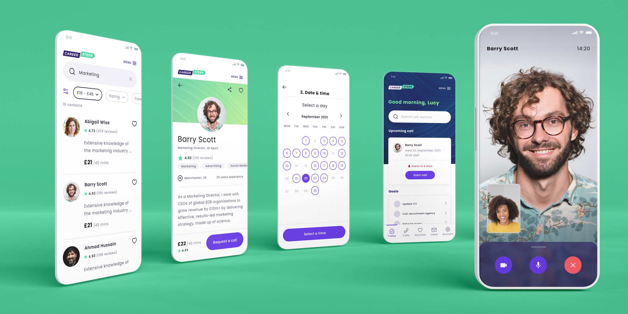
After nearly 6 months of work; researching, prototyping, testing and iterating, I finally had a viable product. With the core features, established users can easily search and book a call with an experienced mentor.

What did I learn?
This project has taught me the value of empathising with users and testing assumptions. Following the design thinking process was time-consuming but worth it, proving essential to the success of the final iteration of the design.
How was I challenged?
Taking the time to empathise with users genuinely enhanced the final product beyond what I could have achieved alone. For example, I’d attempted to keep the design simple by placing the filter icon within the search bar and excluding a label. However, user testing highlighted that I’d actually introduced a lack of clarity as to the icon’s meaning. The reworked design wasn’t necessarily as clean as the first iteration but was much more successful in allowing the user to filter search results. The lesson learnt is that simplicity in design, although very important, isn’t the ultimate goal nor should come at the expense of a user’s ability to achieve their goal.
What can be improved?
I would like to refine the onboarding process for new users by adding appropriately timed coach marks as they start using the different features. I would also like to create a high-fidelity desktop version of the application to ensure that everything works consistently across all formats.
What next?
I feel I’ve only just scratched the surface of what is possible for CareerSteer. I would like to continue to follow the Build – Measure – Learn design cycle, refining the existing functionality and developing new features.
I would like to conduct further user testing using evaluative research methods such as eye-tracking, field studies, diary studies and A/B testing to understand how well the app is achieving its goals and identify which features could be further improved.


